
Applied Art
The Ch'Art Style
«I took colour in its most rigid and objective form and made the computer give it life, shape and movement. I gave colours the freedom to express themselves independently, as individual tints and as large collaborative communities.»
Massimo Cremagnani
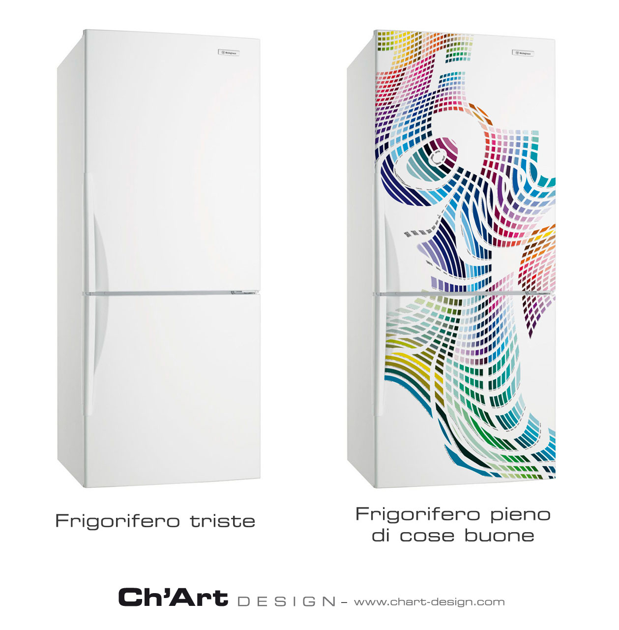
Ch'Art Design is a project in Applied Digital Artversatile enough to allow the free personalisation of any type of object and environment, while maintaining originality, recognisability, aesthetic appeal and emotional engagement.
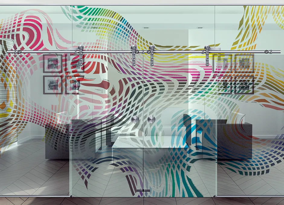
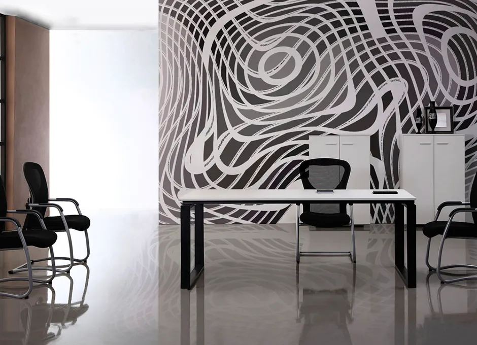
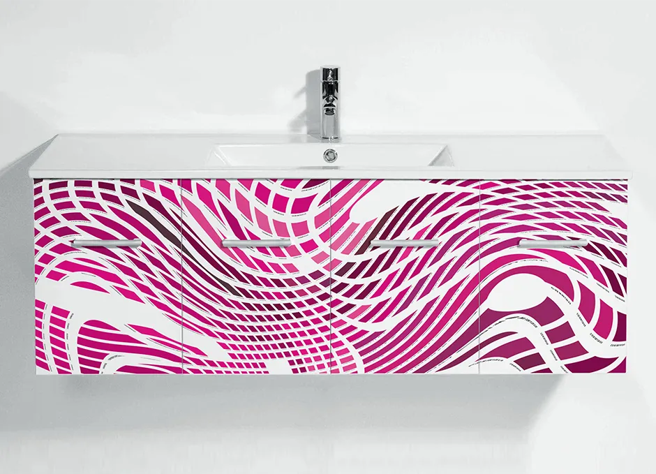
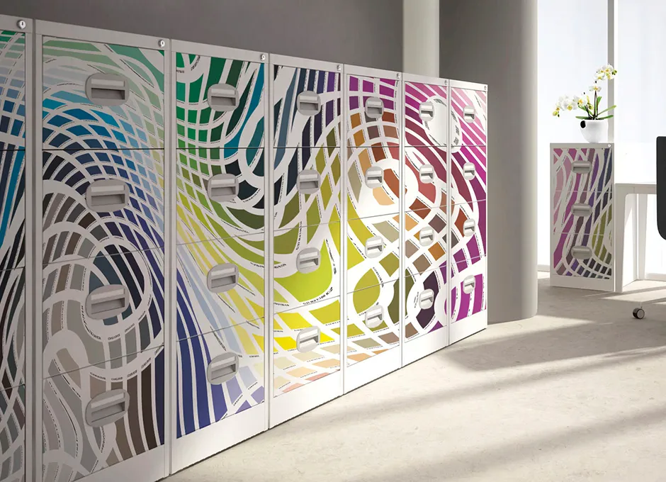
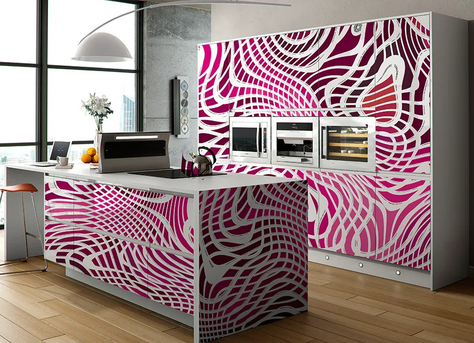
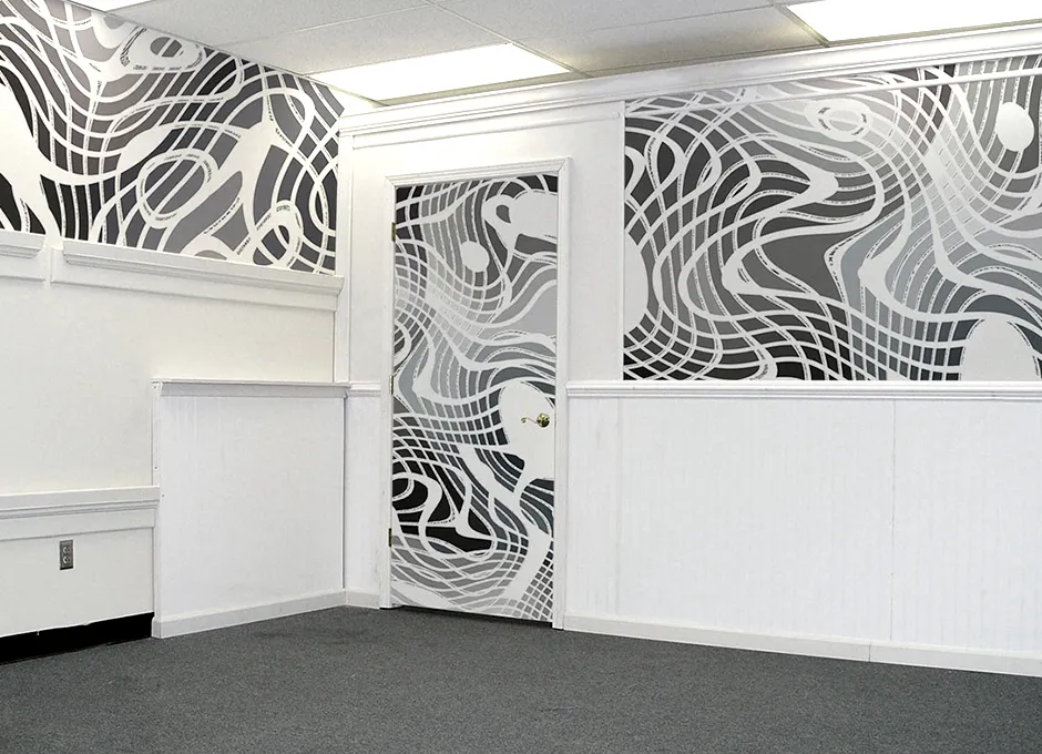
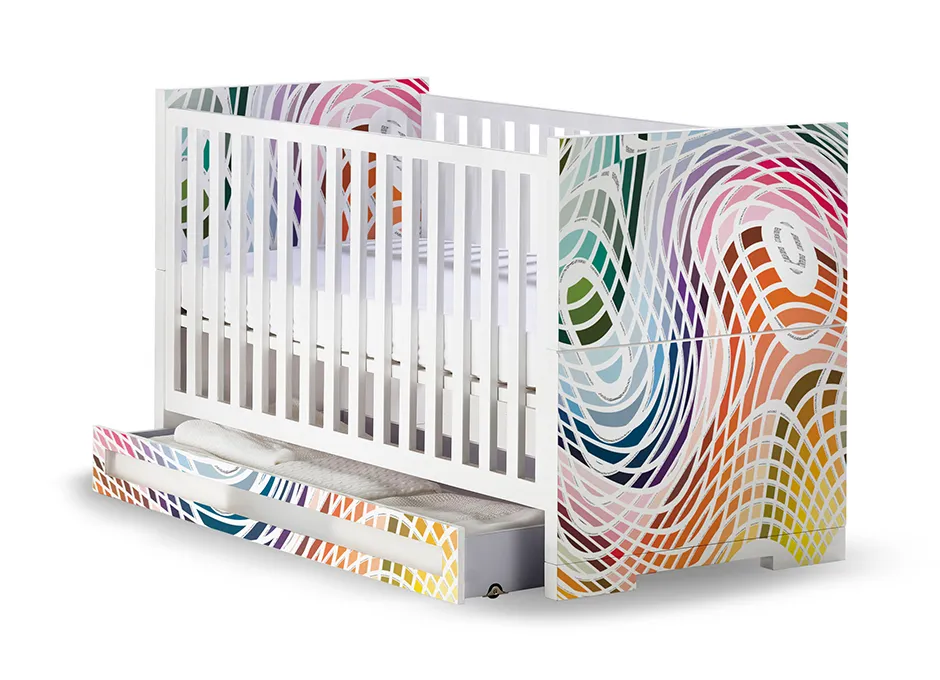
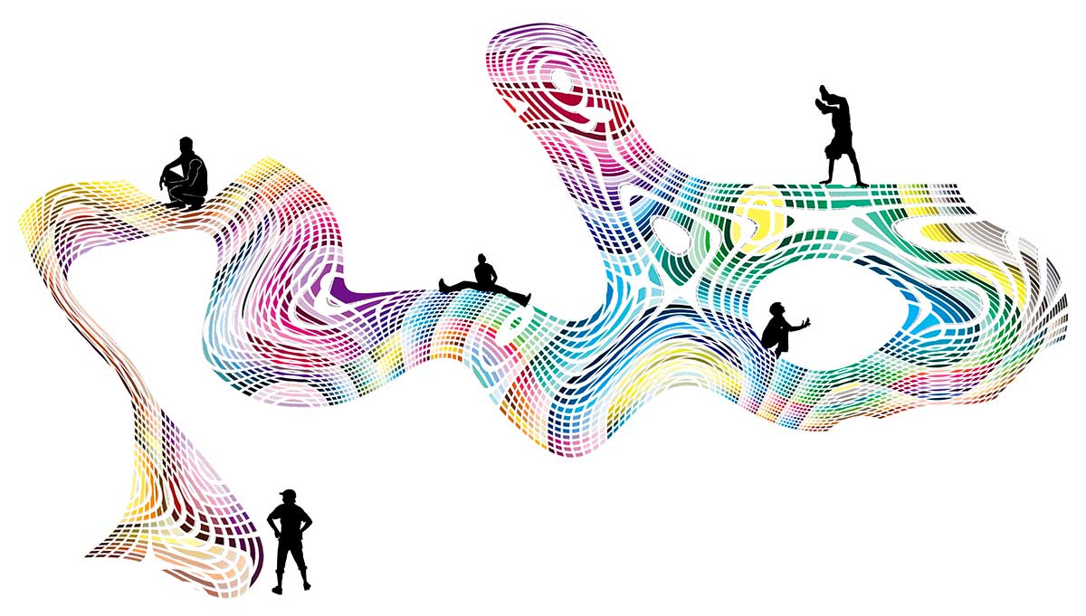
At the core is a wholly digital "wavy mosaic" style, abstract enough to trigger pareidolia: the perception of familiar forms where none exist — much like seeing a dragon, an elephant or a human face in a cloud.
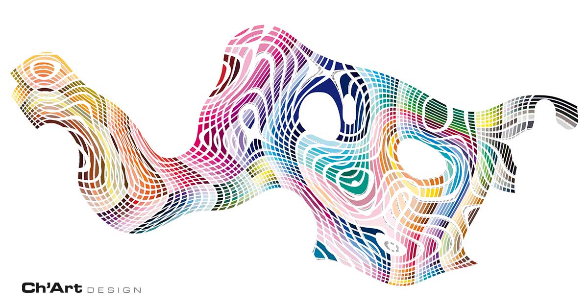
The figurative effect is not always immediately obvious, and its perception is highly subjective. For this reason every Ch'Art creates an absolutely personal relationship with the viewer, more or less intense depending on the moment and their state of mind.
Beyond this interpretive possibility, the power of Ch'Art lies in the emotional influence of its colours, the size of the tiles, their proximity, and the movement all of this suggests.
The tiles are pure, without gradients, because the gradient is provided by the overall view. This is subtly signalled by the small numbers that appear modestly beneath each tile, describing its CMYK component like a kind of identity card.
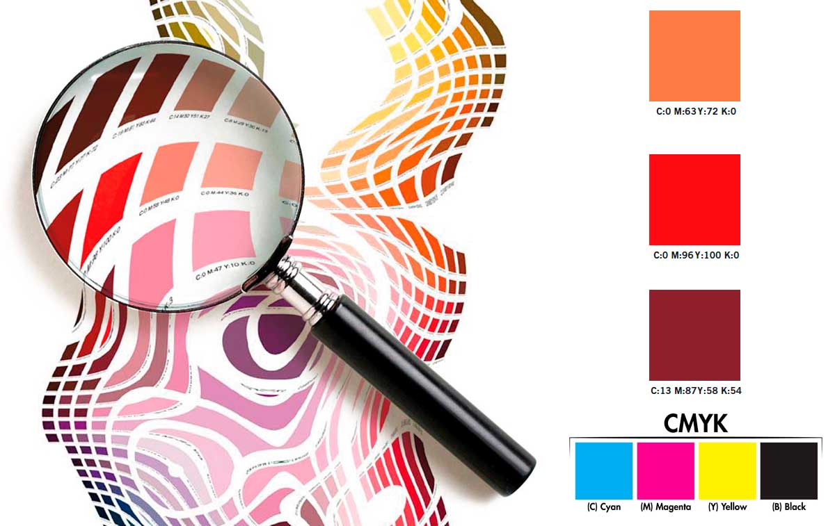
The origins of Ch'Art Design
Ch'Art was born as an artistic experiment around 2008. After years of research in digital painting — where colours blend and overlap — I embarked on a new path using small elements of pure colour. I began arranging and animating them following a recipe of intuition and gestalt, until I reached the biomorphic dynamic I have always pursued.
Ch'Art thus originated in the land of Graphic Arts, as an unusual and dynamic way of carrying out colorimetric and perceptual print tests. In that initial context, it was essential to know which colours printed well and which did not, so the codes were left in place for verification. I also liked thepairing of pure colour with alphanumeric text — two expressive extremes that together could convey a deeper meaning.
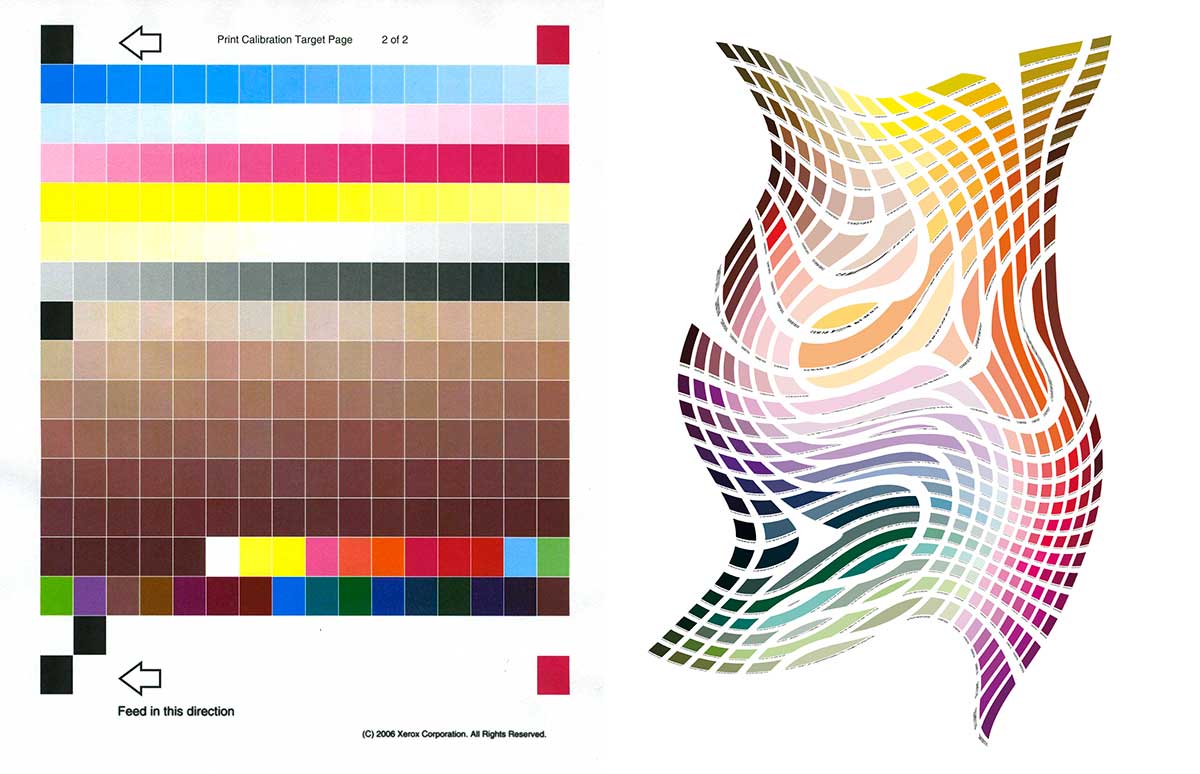
Of course, CMYK labels function scientifically only when printing in four-colour process, as with most laser printers: in many other cases where more than four colours are used, their function is merely indicative — or rather, perceptual. And, as I always maintain, the perception of the viewer is everything, while pure colorimetry serves "only" to calibrate the printing machines.
The purpose of Ch'Art pieces as print tests goes beyond the simple mathematical management of colour. They bring Graphic Arts professionals back toa more human approach, to a deeper knowledge of the imagein order to reach the true visual message.
Ch'Art pieces were used for every type of print and on every type of material. From the results we could identify what worked best, and when we found defects or unpleasant effects we could make the necessary corrections by playing between technology (colorimetry) and experience (perception).
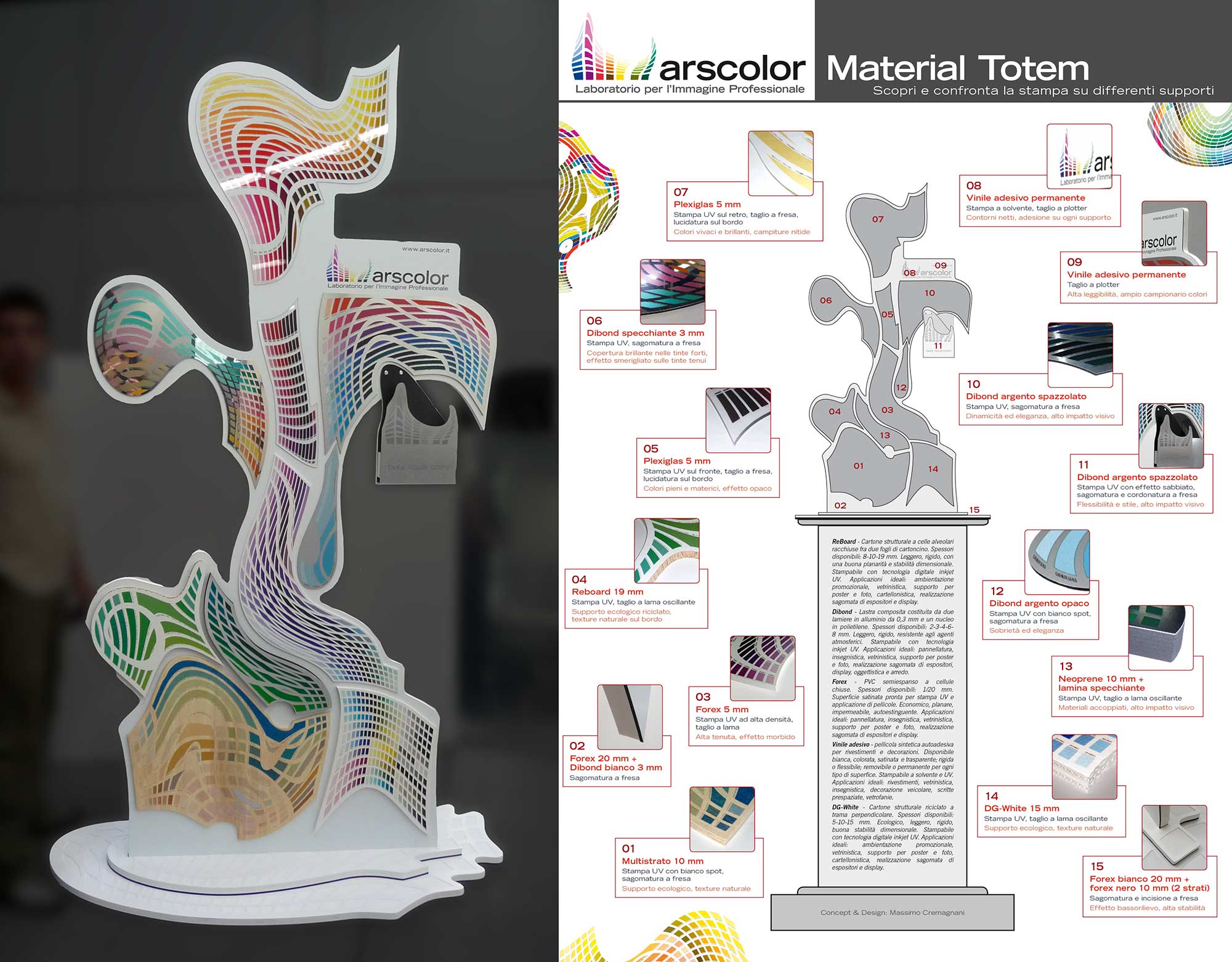
From test prints to Museum
During this research, a digital printing company commissioned me to designa sample collection "unlike any other": something that would impress the client and help them understand the difference between the many materials, printing solutions and visual (and sometimes tactile) effects achievable in digital. The idea emerged of refitting the company with dozens of Ch'Art images, each produced with a particular technique, creating an immersive, experiential journey.
The project, though ready for execution with over 70 different "samples" across more than 500 square metres of building, was ultimately not realised due to lack of funds. But for me the project had already evolved further: the creation of a museum of digital printing calledCh'Art Museum. I thus began a new mission to bring this cultural initiative to life, envisioning spaces and installations, educational and training services, media partners, and even styled furniture and merchandise.
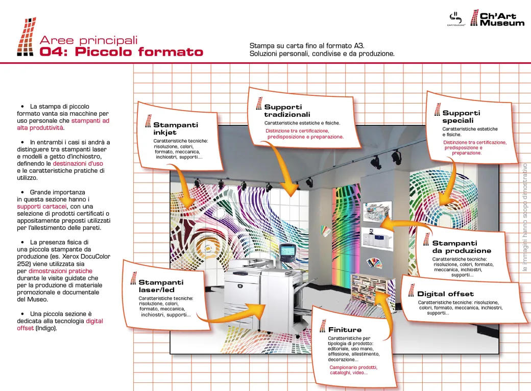
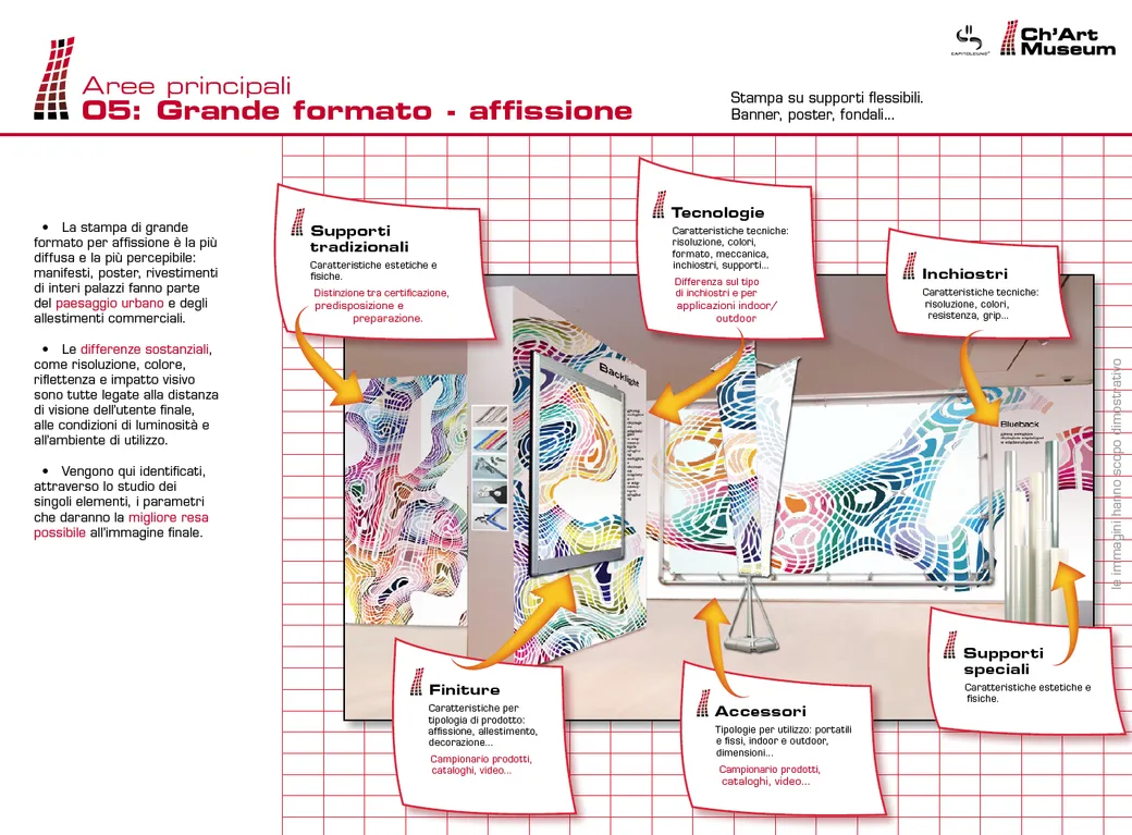
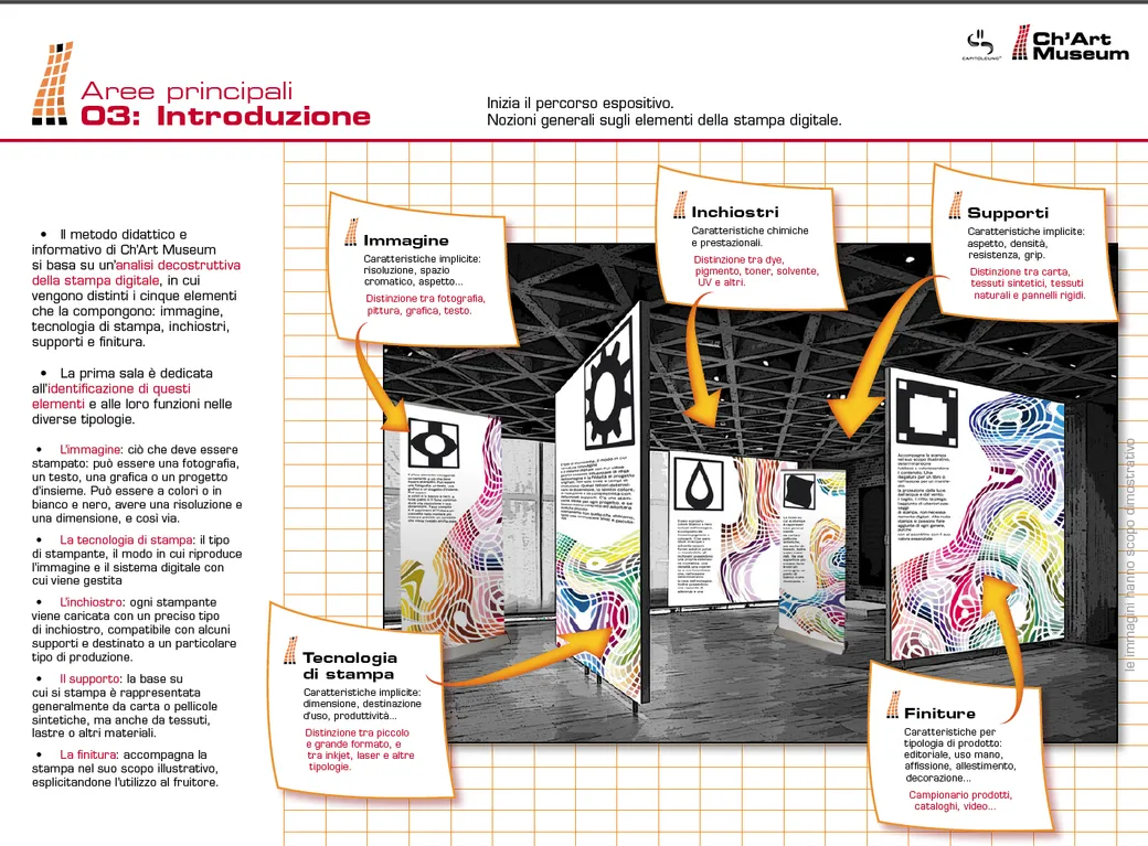
A selection of presentation slides for the Ch'Art Museum project,
the museum of digital printing.
It was precisely while creating prototypes of these furnishing objects that Ch'Art began to attract a strong public following, among both industry experts and the general public. Requests came in for scarves,decorative panels, art prints andfurniture coverings. While waiting to find a venue and the necessary funds for the museum, I began producing its content in the most varied formats, with the aim of captivating an ever wider audience.
Perhaps the Museum will have to wait a little longer, but the research is more alive than ever.
What does Ch'Art mean?
The polychromatic images of Ch'Art represent the dynamic manipulation of colour palettes. The name is a contraction of Chart(a graphic table, but also a colour scheme) and Arte(Italian for Art — for the aesthetic and conceptual references it symbolises).
How a Ch'Art is made
Ch'Art is the bridge between Fine Art, Digital Art and Graphic Arts— a hybrid that draws on the creative tools, production techniques and perceptual theories of all three disciplines.
To better understand how these worlds come together, here is a summary of the creative process.
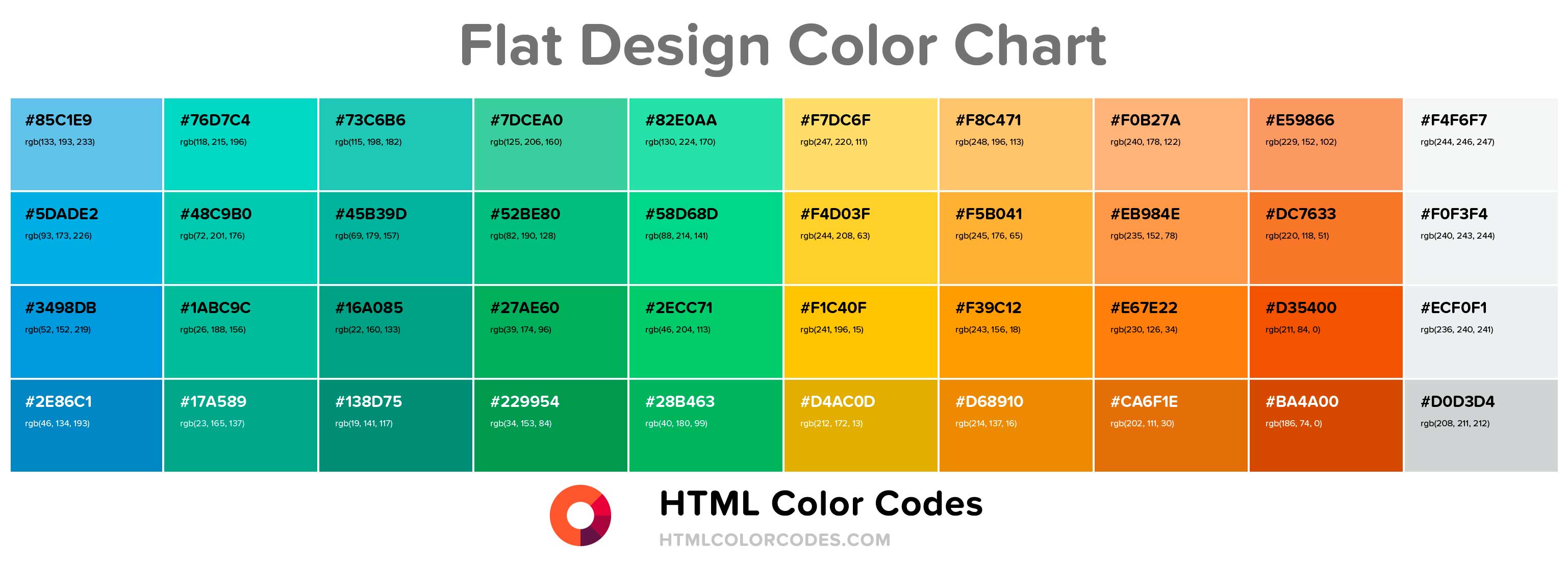
It begins with colour swatches — coloured tiles used as reference by artists, graphic designers and creatives across many generations. Groups of swatches form palettes with different gradations and tones, arranged by affinity or contrast.
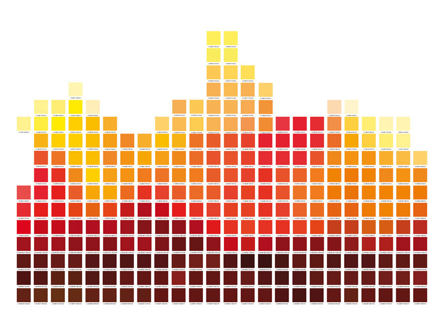
In the example above we see a base palette, specifically created with hues between red and orange to match the environment where the work will be placed.
The shape and number of colours will influence the final design.
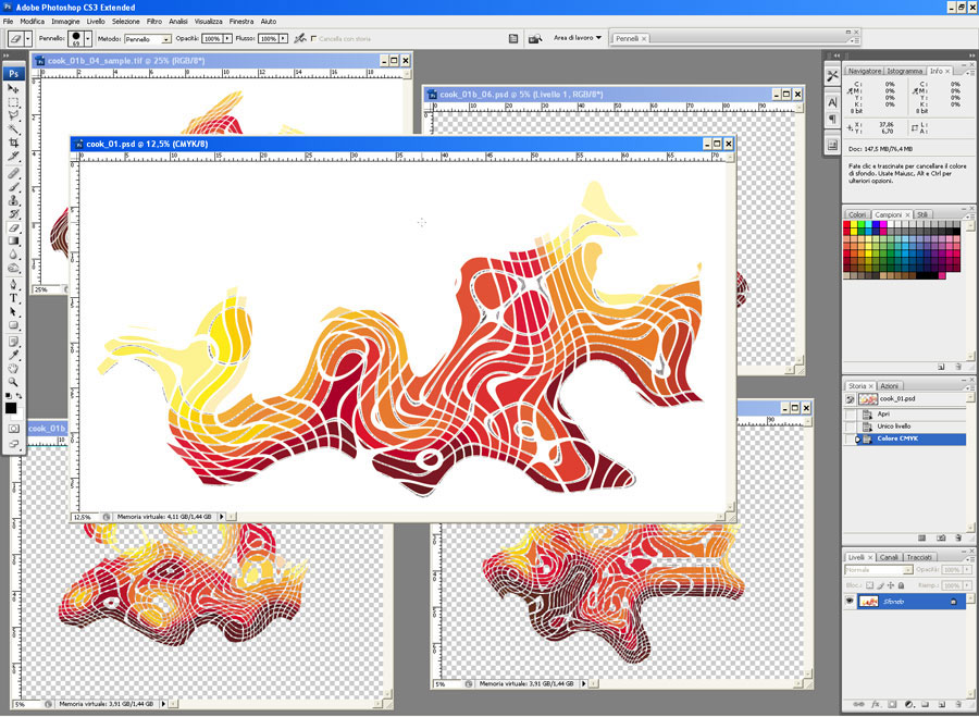
Once defined, the palette is taken and animated into soft, dynamic forms. From the same palette several Ch'Art pieces can be made, providing an additional opportunity for selection.
For evaluation, a rendering is produced in the destination environment with the selected Ch'Art pieces, sometimes with minor adjustments.
Once the subject is chosen, work moves to the executive brief, defining in detail the dimensions, material, printing technique (printer type, inks and any additional settings) and notes for installation.
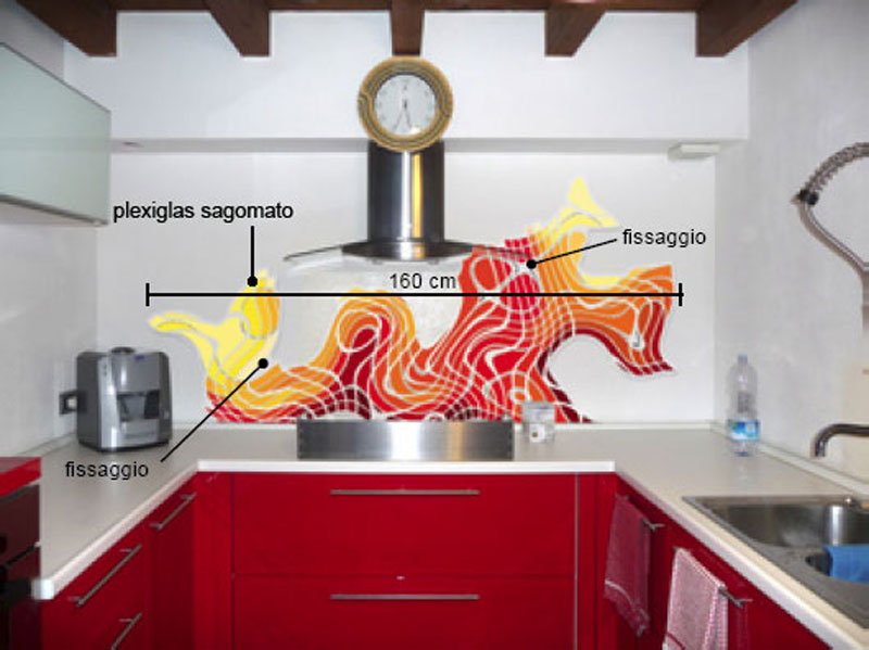
Colours, dimensions and the dynamics of the works are calibrated according to the final destination — from several metres of wall to the few centimetres of a phone case. These factors are also compared with the material on which the image will be printed, taking into account any chromatic dominance or partial transparency, a material texture and reflectivity.
Once all of this is defined, I choose the most suitable digital printing technology for material compatibility, visual quality, durability and so on. (If you think this is simple, perhaps you should read my book!)
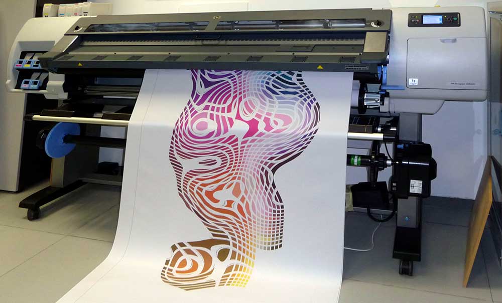
This is the process I follow for every work.
A reminder that for every project the following are carefully studied:
- The colours you prefer, in line with the destination environment
- The dynamic that appeals to you — gentle or bold
- The most suitable and durable printing materials
- The right size for your space
Want to know more about Ch'Art?
